Because I design and implement web applications, the issue of how people discover existing features in them and how easily they can accomplish their tasks is a daily concern. The most important rule of iterative interactive design is to believe user complaints. This may seem so obvious as to go without calling it out, but it should be the mantra of all app designers. It is not.
I will quickly confess that I do not hold my user experience or design skills in the highest regard. But I have learned enough to know how grievous many of my earlier designs are and how hard it is to produce "invisible design."
Given this professional concern, you can imagine that when I run into badly designed user interfaces outside of my job that it rather sends me around the bend.
Let's talk toasters and stoves.
I have a lovely toaster. Here is a close up of the controls on it:
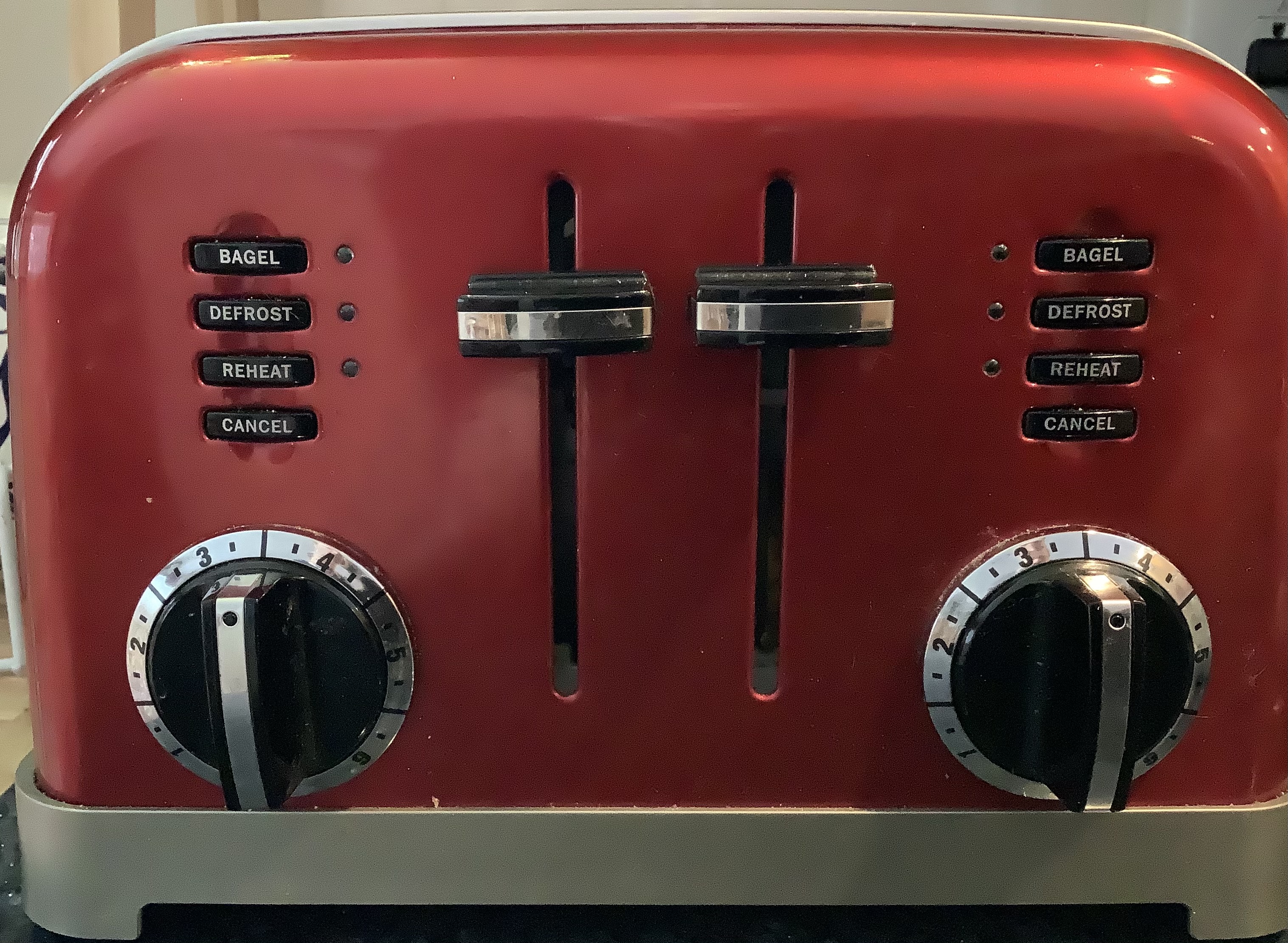
Aesthetically, it is a handsome bit of sculpture. It's got that retro, Art Nouveau style that an aging, mid-century man like me enjoys. However, I have old man eyes. In the morning, when I am most likely to use the toaster, my eyes are particularly useless.
Given that, let's look at temperature controls on this unit. There are two dial controls. Dials are a fine way to translate heat intensity to a physical motion. However, look carefully at the position indicator on the dial. Do you see it? I suspect most of you can when you are looking this photo, but please note that small black dot is easily lost in the glare of the "chrome" bits of the design. Under lower light conditions (such as those common found in the morning when 100% of my breakfasts occur), it is possible to carelessly misidentify this indicator so that the control is set 180 degrees further into the "dark toast" settings that I want.
Hold that thought because I have another kitchen application with similar controls that presents similar problems.
Here are the controls for two burners on my stove top:
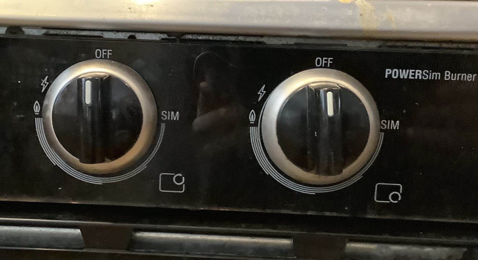
Again, the aesthetics of this stove is pleasing to me. It too has a mid-century modern appearance with stainless steel bits. The dial controls are arranged intuitively enough for me. Unlike the toaster, the stove designers made the dial indicator a line rather than a dot.
Since it is a gas stove, the 11 o'clock position causes a spark that sets the gas on fire. As you rotate the dial anti-clockwise past that the burner attenuates from full gas flow to its lowest setting (which is around 3 o'clock). A good amount of the time, I am cooking things with this dial at the 6 o'clock position.
When you are paying attention, these stove controls are great and easy to use. The trouble comes at the end of dinner prep when you are transition from cook to waiter. At least for me, my attention shifts away from cooking concerns after I dump the food into a service container. I am hungry and prefer my food eaten hot. Many is the time I forget, in my rush to eat, to turn off the burner, especially when the dial is in the 3 o'clock or 6 o'clock position.
When a burner is set to simmer there is hardly any flame visible. When the dial is at 6 o'clock the indicator appears similar to the off position.
Either way from my table, I cannot see the flames of the burner and the dials do not stand out.
For a long time I thought there was little to be done to help me with these problems. However, my wife is currently taking a design course. After discussing some of the challenges she was working through, it got me thinking again about my appliance UX problem. What is the core problem with the toast and stovetop controls? I submit that these controls do not offer clear enough indicators of their current state when viewed from normal, but sub-optimal positions.
Taking a page out of early rocket design, it occurred to me that painting one hemisphere of the dial control would be enormously helpful. Observe:
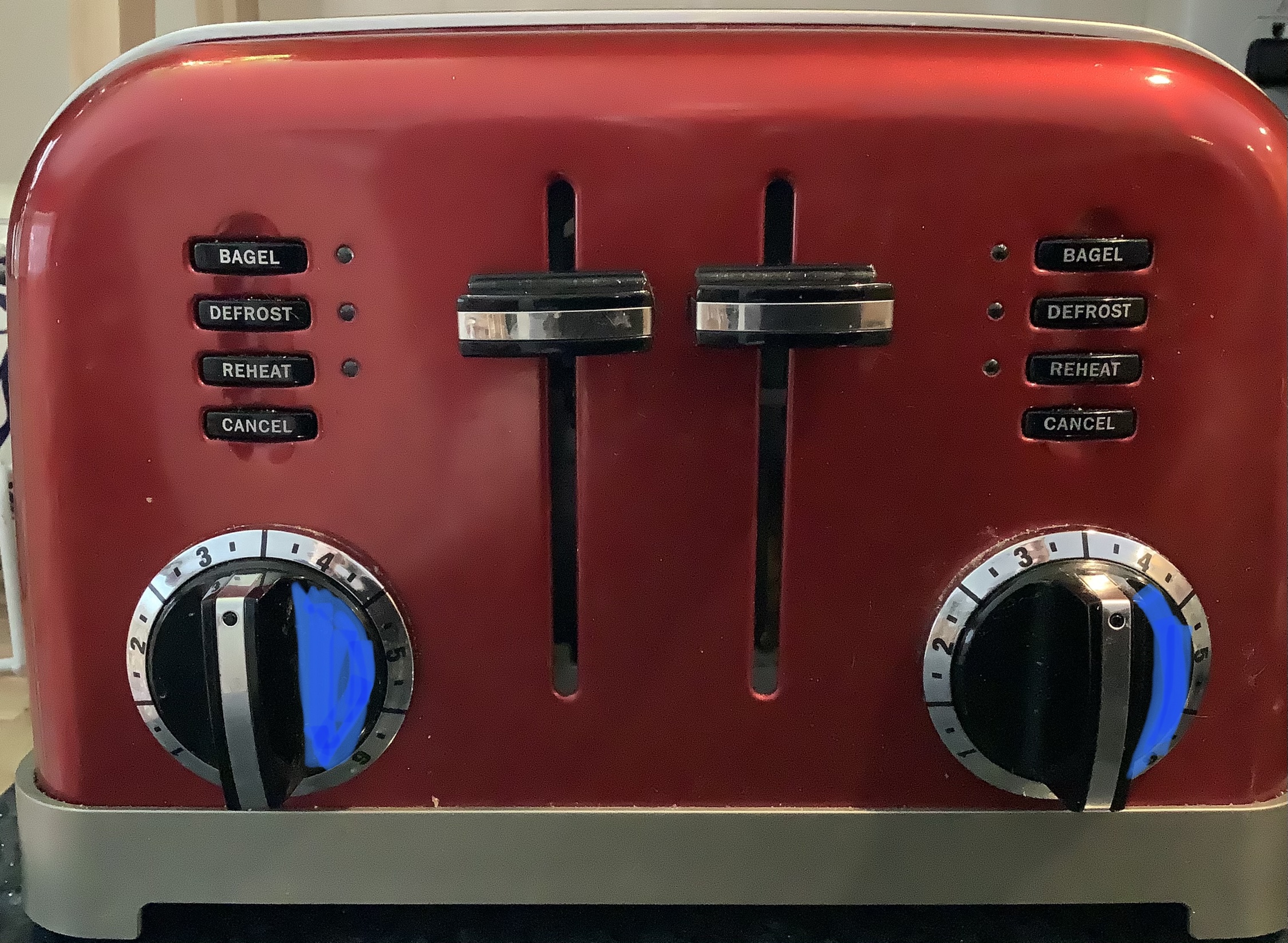
And also:
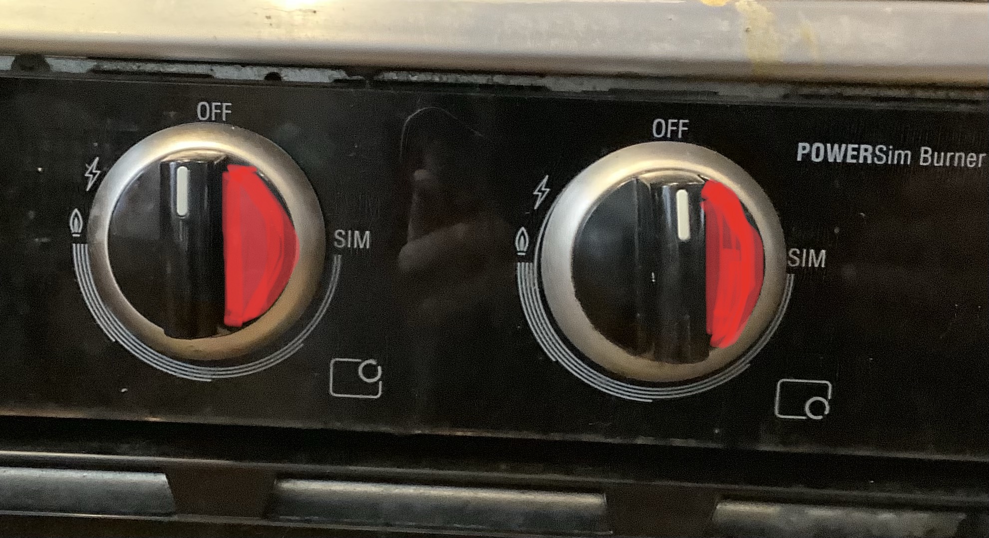
Now, before I get cancelled, let me assure you that this is a design idea. I am not literally going to take a highlighter and color these dials. Such a solution would cause "domestic inquietude". However, the principal of making the two hemispheres of the dial visually distinct has been used in other places to great success. In the future, I hope appliance designers consider how their controls present in less than perfect conditions.
The title of this post is a nod to the very excellent book The Design of Everyday Things by Don Normal. If this post tickled your fancy, read what a UX pro has to say about our designed world.